| x |
x |
o |
y |
y |
| x |
x |
x |
x |
y |
| o |
x |
z |
z |
y |
| z |
x |
z |
o |
y |
| z |
z |
z |
y |
y |
It's a 5x5 grid of holes, connected as shown in the diagram. Each colored path contains one peg which can be moved around to any other square with the same color. The point of the game is to fit the 6 uniquely shaped pieces in the puzzle such that all of them fit (and subsequently fill up the entire matrix).
### Pieces
Very similar to tetris:
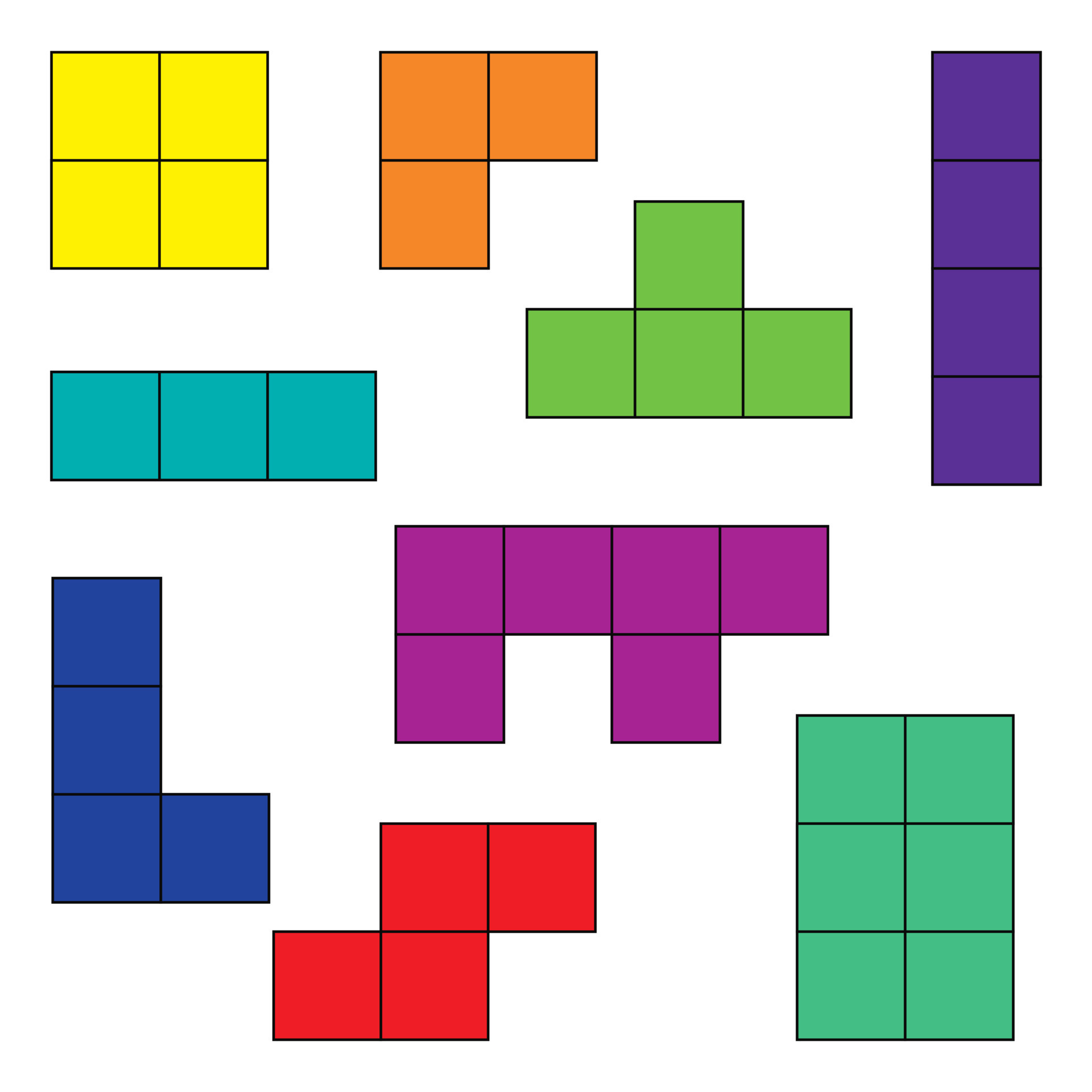
The pieces are as follows:
#### 3-in-a-row
Effectively 2 different ways to place it. It's just 3 consecutive squares.
#### L shape
There are 4 different ways to place it. It's a 3-in-a-row with an extra square attached to one of the ends.
You can also use the third dimension and flip it, leading to 8 different ways to place it.
#### T shape
There are 4 different ways to place it. It's a 3-in-a-row with an extra square attached to the middle.
#### Square
1 way to place it. It's a 2x2 square.
#### Smaller L shape
There are 4 different ways to place it. It's a 2-in-a-row with an extra square attached to one of the ends.
#### 2 lines offset by 1
4 different ways.
## Optimization
- [ ] Bitmasking
- Pre-computing all possible positions of the pieces
- [x] Themselves
- [ ] On the (5x5) board
- [x] Skip recomputation of *forbidden* pins by flipping the matrix around (sort of)
- [ ] Store partial solutions (very hard)
## Probabilities
### Data
#### Loading Data and libs
```{r, message=FALSE}
library(jsonlite)
library(dplyr)
library(tidyr)
library(ggplot2)
library(plotly)
```
```{r}
data <- fromJSON("../src/data_extended.json")
```
#### Data Exploration
```{r}
head(data)
```
Each record contains three forbidden pins (`pinA`, `pinB`, `pinC`) and a `solution_count`. Important:
- The first value in each tuple is the y-coordinate (row), and the second value is the x-coordinate (column).
- `solution_count` indicates how many unique puzzle solutions exist when pins are placed in the specified positions.
### Data Preparation
#### Flattening Pin Positions
Since each pin is represented by a two-element vector (`[y, x]`), we separate these into individual columns:
```{r}
data <- data %>%
rowwise() %>%
mutate(
pinA_y = pinA[1],
pinA_x = pinA[2],
pinB_y = pinB[1],
pinB_x = pinB[2],
pinC_y = pinC[1],
pinC_x = pinC[2]
) %>%
ungroup() %>%
select(-pinA, -pinB, -pinC)
```
We now have six columns representing the coordinates of each forbidden pin:
- `pinA_y`, `pinA_x`
- `pinB_y`, `pinB_x`
- `pinC_y`, `pinC_x`
### Game Context
The IQ Mini 4489 puzzle is played on a $5\times 5$ grid, but the "tracks" for pin placement are defined in the [table provided above](#table-container) where:
- Orange signifies `pinA`'s range
- Green signifies `pinB`'s range
- Purple signifies `pinC`'s range
We will compare two scenarios:
1. Scenario A: Pins (`pinA`, `pinB`, `pinC`) can be placed anywhere on the $5\times 5$ grid.
2. Scenario B: Pins are restricted to their specific tracks as defined in the table.
### Exploratory Data Analysis
#### Distribution of Solution Counts
To visualize how often each solution count occurs, we use a histogram:
```{r}
ggplot(data, aes(x = solution_count)) +
geom_histogram(binwidth = 5, fill = "blue", color = "black") +
theme_minimal() +
labs(
title = "Distribution of Solution Counts",
x = "Solution Count",
y = "Frequency"
)
```
#### Forbidden Pin Influence on Solution Counts
We examine how the y-coordinates of each pin influence the `solution_count`. Below is an example focusing on `pinA_y`:
```{r combined-boxplots, fig.height=6, fig.width=8, echo=FALSE}
# Reshape data for boxplots
boxplot_data <- data %>%
pivot_longer(
cols = starts_with("pin"),
names_to = c("Pin", "Coordinate"),
names_pattern = "(pin[A-C])_(.)",
values_to = "Value"
) %>%
filter(Coordinate == "y") %>% # We're focusing on y-coordinates
select(Pin, Value, solution_count)
# Create the faceted boxplot
ggplot(boxplot_data, aes(x = factor(Value), y = solution_count)) +
geom_boxplot(fill = "#3498db", color = "black") +
facet_wrap(~ Pin, ncol = 3) +
theme_minimal() +
labs(
title = "Solution Counts by Pin Y-Coordinate",
x = "Y-Coordinate",
y = "Solution Count"
) +
theme(
strip.text = element_text(size = 12, face = "bold"),
axis.text = element_text(size = 10),
axis.title = element_text(size = 12)
)
```
Seems like they are all pretty much the same.
### Scenario Analysis
#### Scenario A: Pins Can Be Placed Anywhere
Under this assumption, all grid squares are valid for pin placement.
- Observations:
- Certain positions may drastically lower the number of solutions, especially if they block puzzle pieces.
- For example, placing a forbidden pin in the center might have a different impact compared to placing it in a corner.
- Pairwise Heatmap (Example with the mean `solution_count` of `pinA_x` vs. `pinB_x`)
```{r, echo=FALSE}
# Aggregate data for heatmap
heatmap_data <- data %>%
group_by(pinA_x, pinB_x) %>%
summarise(solution_count = mean(solution_count), .groups = 'drop')
# Create the heatmap
ggplot(heatmap_data, aes(x = pinA_x, y = pinB_x, fill = solution_count)) +
geom_tile() +
scale_fill_gradient(low = "blue", high = "red") +
theme_minimal() +
labs(
title = "Solution Count Heatmap (Pins Anywhere)",
x = "Pin A X",
y = "Pin B X",
fill = "Solution Count"
)
```
We can see that the solution count is generally higher when the pins are further apart and that my observations were correct.
#### Scenario B: Pins Must Follow Their Tracks
Here, each pin must stay on its designated track. **Note that we're using aggregated data for this analysis.** (i.e., we're taking the mean of `solution_count` for each unique pin configuration).
##### Defining Valid Positions
First, we define the allowed positions for each pin based on the game context:
```{r}
allowed_pinA <- tibble(
pinA_y = c(0, 0, 1, 1, 1, 1, 2, 3), # Orange track
pinA_x = c(0, 1, 0, 1, 2, 3, 1, 1)
)
allowed_pinB <- tibble(
pinB_y = c(0, 0, 1, 2, 3, 4, 4), # Green track
pinB_x = c(3, 4, 4, 4, 4, 3, 4)
)
allowed_pinC <- tibble(
pinC_y = c(2, 2, 3, 3, 4, 4, 4), # Purple track
pinC_x = c(2, 3, 0, 2, 0, 1, 2)
)
```
##### Filtering Data for Scenario B
Next, we filter the dataset to include only the configurations where each pin is placed on its respective track:
```{r}
valid_scenarioB <- data %>%
semi_join(allowed_pinA, by = c("pinA_y", "pinA_x")) %>%
semi_join(allowed_pinB, by = c("pinB_y", "pinB_x")) %>%
semi_join(allowed_pinC, by = c("pinC_y", "pinC_x"))
```
##### Analyzing Scenario B
Once filtered, we can perform similar analyses as in Scenario A:
- Distribution of Solution Counts:
```{r, echo=FALSE}
ggplot(valid_scenarioB, aes(x = solution_count)) +
geom_histogram(binwidth = 5, fill = "green", color = "black") +
theme_minimal() +
labs(
title = "Distribution of Solution Counts (Pins on Tracks)",
x = "Solution Count",
y = "Frequency"
)
```
- Pairwise Heatmap (Example with `pinA_x` vs. `pinB_x`):
```{r, echo=FALSE}
# Aggregate data for heatmap
heatmap_data_B <- valid_scenarioB %>%
group_by(pinA_x, pinB_x) %>%
summarise(solution_count = mean(solution_count), .groups = 'drop')
# Create the heatmap
ggplot(heatmap_data_B, aes(x = pinA_x, y = pinB_x, fill = solution_count)) +
geom_tile() +
scale_fill_gradient(low = "blue", high = "red") +
theme_minimal() +
labs(
title = "Solution Count Heatmap (Pins on Tracks)",
x = "Pin A X",
y = "Pin B X",
fill = "Solution Count"
)
```
Wow, that's an interesting one!
The observation here is that it is not similar to the previous one whatsoever.
Once `pinA_x` is placed at 3, the solution count is generally lower, regardless of the `pinB_x` position.
A hypothesis as to why this is the case is that the `pinA` track is close to the edge of the board, which might limit the movement of puzzle pieces.
That hypothesis crumbles, however, as once `pinB_x` is placed at 3.5, specifically when `pinA_x` $< 3$, the solution count is generally higher. This suggests that the `pinB` track might have a more significant impact on the puzzle's solvability.
Considering this interesting development, let's look at the other pairwise heatmaps to see if there are any similar patterns.
```{r, echo=FALSE}
# Aggregate data for heatmap
heatmap_data_B <- valid_scenarioB %>%
group_by(pinB_x, pinC_x) %>%
summarise(solution_count = mean(solution_count), .groups = 'drop')
# Create the heatmap
ggplot(heatmap_data_B, aes(x = pinB_x, y = pinC_x, fill = solution_count)) +
geom_tile() +
scale_fill_gradient(low = "blue", high = "red") +
theme_minimal() +
labs(
title = "Pins on Tracks, Pin B X vs. Pin C X",
x = "Pin B X",
y = "Pin C X",
fill = "Solution Count"
)
```
```{r, echo=FALSE}
# Aggregate data for heatmap
heatmap_data_B <- valid_scenarioB %>%
group_by(pinA_x, pinC_x) %>%
summarise(solution_count = mean(solution_count), .groups = 'drop')
# Create the heatmap
ggplot(heatmap_data_B, aes(x = pinA_x, y = pinC_x, fill = solution_count)) +
geom_tile() +
scale_fill_gradient(low = "blue", high = "red") +
theme_minimal() +
labs(
title = "Pins on Tracks, Pin A X vs. Pin C X",
x = "Pin A X",
y = "Pin C X",
fill = "Solution Count"
)
```
Observing the above heatmaps, more interesting patterns emerge. Seems like it's definitive that if `pinA_x` is placed at 3, the solution count is generally lower, regardless of the other pins' positions. This is a stark contrast to the scenario where pins can be placed anywhere, where the solution count was generally higher when the pins were further apart.
The highest solution counts are observed when `pinA_x` is placed at 0 or 1, and `pinB_x` is placed at 3 or 4. This suggests that the puzzle is more solvable when the `pinA` and `pinB` tracks are further apart on the x axis.
It's also curious that when `pinA_x` is placed at 3 and `pinC_x` $\in [1,2]$ we get the lowest solution counts of $10$.
Let's wrap this up with a final comparison of all three pins' positions:
```{r, echo=FALSE}
# Aggregate data for three-way interaction
heatmap_data_abc <- data %>%
group_by(pinA_x, pinB_x, pinC_x) %>%
summarise(solution_count = mean(solution_count), .groups = 'drop')
plot_ly(
data = heatmap_data_abc,
type = "parcoords",
line = list(color = ~solution_count, colorscale = "Viridis"),
dimensions = list(
list(label = "pinA_x", values = ~pinA_x),
list(label = "pinB_x", values = ~pinB_x),
list(label = "pinC_x", values = ~pinC_x),
list(label = "Solution Count", values = ~solution_count)
)
)
ggplot(heatmap_data_abc, aes(x = pinA_x, y = pinB_x)) +
geom_point(aes(size = pinC_x, color = solution_count), alpha = 0.7) +
scale_color_gradient(low = "blue", high = "red", name = "Solution Count") +
labs(
title = "Bubble Chart of pinA_x vs pinB_x",
x = "pinA_x",
y = "pinB_x",
size = "pinC_x"
) +
theme_minimal()
```
### 3D Visualization
We can use a 3D scatter plot to visualize how pin positions affect `solution_count` for both scenarios. These are a bit confusing, but they're fun to look at.
- Scenario A (Pins Anywhere):
```{r, echo=FALSE}
plot_ly(data, x = ~pinA_x, y = ~pinB_x, z = ~solution_count, color = ~solution_count) %>%
add_markers() %>%
layout(
title = "Solution Count by Pin A X & Pin B X (Pins Anywhere)",
scene = list(
xaxis = list(title = "Pin A X"),
yaxis = list(title = "Pin B X"),
zaxis = list(title = "Solution Count")
)
)
```
- Scenario B (Pins on Tracks):
```{r, echo=FALSE}
plot_ly(valid_scenarioB, x = ~pinA_x, y = ~pinB_x, z = ~solution_count, color = ~solution_count) %>%
add_markers() %>%
layout(
title = "Solution Count by Pin A X & Pin B X (Pins on Tracks)",
scene = list(
xaxis = list(title = "Pin A X"),
yaxis = list(title = "Pin B X"),
zaxis = list(title = "Solution Count")
)
)
```
### Probability Analysis
We categorize `solution_count` into three levels:
- High (upper 25%)
- Medium (50%, average)
- Low (lower 25%)
based on the 25th and 75th percentiles, and then compute probabilities for both Scenario A and Scenario B.
#### Defining Categories
```{r}
high_threshold_A <- quantile(data$solution_count, 0.75)
low_threshold_A <- quantile(data$solution_count, 0.25)
data <- data %>%
mutate(solution_category_A = case_when(
solution_count >= high_threshold_A ~ "High",
solution_count <= low_threshold_A ~ "Low",
TRUE ~ "Medium"
))
high_threshold_B <- quantile(valid_scenarioB$solution_count, 0.75)
low_threshold_B <- quantile(valid_scenarioB$solution_count, 0.25)
valid_scenarioB <- valid_scenarioB %>%
mutate(solution_category_B = case_when(
solution_count >= high_threshold_B ~ "High",
solution_count <= low_threshold_B ~ "Low",
TRUE ~ "Medium"
))
```
#### Calculating Probabilities
##### Scenario A Probability Analysis
```{r}
probabilities_A <- data %>%
group_by(solution_category_A) %>%
summarise(count = n(), .groups = 'drop') %>%
mutate(probability = count / sum(count))
probabilities_A
```
##### Scenario B Probability Analysis
```{r}
probabilities_B <- valid_scenarioB %>%
group_by(solution_category_B) %>%
summarise(count = n(), .groups = 'drop') %>%
mutate(probability = count / sum(count))
probabilities_B
```
#### Visualizing Probabilities
**Note that HIGH would mean "easy" in this case**.
```{r, echo=FALSE}
probabilities_A <- probabilities_A %>%
rename(solution_category = solution_category_A) %>%
mutate(Scenario = "A (Pins Anywhere)")
probabilities_B <- probabilities_B %>%
rename(solution_category = solution_category_B) %>%
mutate(Scenario = "B (Pins on Tracks)")
probabilities_combined <- bind_rows(probabilities_A, probabilities_B)
# plot
ggplot(probabilities_combined, aes(x = solution_category, y = probability, fill = Scenario)) +
geom_bar(stat = "identity", position = "dodge") +
theme_minimal() +
labs(
title = "Probability of Solution Categories",
x = "Solution Category",
y = "Probability",
fill = "Scenario"
)
```
## Conclusion
Scenario B's constraints reduce the solvability of the puzzle compared to Scenario A, as evident in the increased proportion of Low solution counts. **Clearly**, the placement of pins has a significant impact on the puzzle's solvability, more so positively in an unconstrained environment.